About 1981 a Process started that pumps income from the lower earning households into the pockets of the highest earners
The Income Pump
The LastTechAge post Zero Sum Game developed published data by Anthony Atkinson , Thomas Peketty and Emmanuel Saez , along with published data from Robert Reich to show that a process started in the US about 1980 or 1981 that has continued to this date, and has proven highly efficient at transferring income from the the lower U.S. household incomes into the incomes of the highest earners in America.
Summary of the argument We are looking at income from a slightly different way than you might be used to. Think when you were a kid and went to a school swimming pool, or maybe the Y’s. You knew bullies were present when the little kids were pushed into smaller and smaller parts of the pool – their share of the pool dropped as the bullies grabbed more of the pool for themselves.
Now think of the total income by all earners in the U.S. as forming a giant pool, amounting to 100% of all earned (every year, there will be 100% earned). The data show that a very small fraction of the bigger kids in the income pool are grabbing hugely larger fractions for their own, at the expense of the vast majority of us little kids who are desperately trying to swim about in ever decreasing room.
This is what the data (below) show. For 35 years after WW-II, life was pretty steady with the different parts of our population in pretty constant fractions of the pool. About 1981, the bullies started grab ever larger fractions of the total income.

Fig A: Click for larger image. Share fraction of total income: The top earning 10% of households in the US.
The Data Click either of the two graphs shown to see larger images.
Fig A is from Atkinson, Peketty and Saez with trend lines added here to help see what is happening.
The important point is that the fraction of total income made by rich American households suddenly started to rise in 1980 or ’81 due to an unknown Process, or possibly, Processes.
The more detailed discussion of Zero Sum (see the top paragraph) indicates that the mysterious 1981 Process is an income pump, deflating the total amount for the lower earners while increasing the income volume for the very rich.

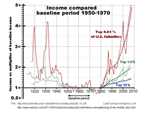
Fig B: Click for largerl image. 10%, 1% and 0.01% incomes compared to fraction of earnings during the baseline years.
Fig. B includes all the data sources indicated in the introduction paragraph. It presents a different way of looking at the data.
We use the fact that the data for each earning class fluctuate about a flat trend line during the baseline period from just after WW-II until 1981. Our baseline for calculations is an interior subset from 1950-1970.
Although each group’s baseline value is different for each economic grouping, the graph compares growth in income fraction of each relative to the baseline. The heavy dotted lines (1981 – 2010) are aids to visualization of the trends.
What we had… During that baseline time, the US was at its most vibrant with huge optimism that every segment of society could overcome its problems and join together in prosperity, if not for every person then for any person’s children. We were certain: opportunity to do better in our lives was becoming progressively better with each successive decade that passed.
 What we have become… The share of the total by the top earning 10% of households grew to about a quarter more than its baseline value (1.25× bigger). The topmost 0.01% saw their fraction rise by a factor of five (400%).
Interestingly, the income fractions for the elites and ultras dropped a bit between the mid 1970s and about 1980.
 The class that made out best as a result of the income pump are our ultras. This category contains 11,900 households and starts at an annual income of about $11 M, or $5,300/hour (= $11 M/2080 hrs).
The fraction of US incomes distributed to the top 1/5 stayed constant since 1980. Below this top 20%, all households lost some fraction of their share of the total pool.
 To be in the top 20%, one must make more than $48.08/hr. But this top quartile includes all high earners … and the income pump distributes shares in proportion to amount of wealth. Although the quartile maintained a constant share fraction of the U.S. income, the presence of the huge earners implies that, probably, those earning below the quartile’s mean value income of $81.74/hr probably lost income fraction and purchasing power after the pump turned on. No wonder these guys whine a lot.
Important Process Some of our core posts discuss the process summarized here as the American Income Pump. This page will be a frequently used for reference in LastTechAge posts.
——————————————————————————————
Charles Armentrout — Ann Arbor
2012 May 14, 2012 May 21
Send email: LastTechAge@gmail.com
