
This is the LastTechAge collection of all data trends currently found that correlate with Saez-Piketty Inequality (SPI) trends.
This PAGE supplements our INDEX by listing the graphs of data sets that correlate with data by Emmanuel Saez, Thomas Piketty and co-workers.
Click any graph for full resolution image
Basic SPI graphs
Saez data … intro to SPI
• Zero Sum Game, • Piketty, • Records

Income to top earning 10% of population
Growth of top incomes as multiples of baseline
• Elites or Ultras?, • Zero Sum Game

10%, 1% and 0.01% incomes compared to baseline
Lowest 20% anti-correlates with top 10%
• MinWage – Poverty

David Brooks, Piketty Discovers America
Mid Quintile income anti-correlates top 10%
• Mankiw

Middle 20%
Correlated data trends
1. Gini, flawed as it is, correlates with SPI
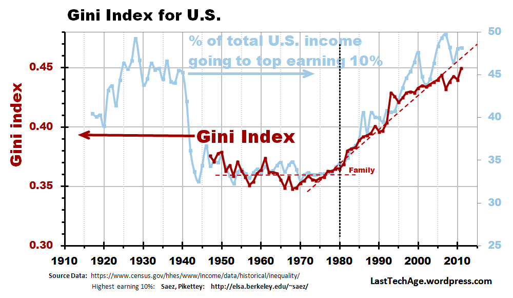
Gini & SPI
2. Startups anti-correlate with SPI
• Business Startups
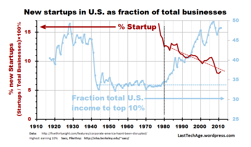
Stratip rate .
3. College tuition Correlates with SPI
• Tuition Addition
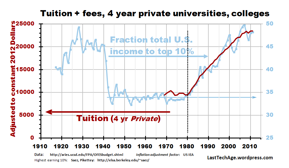
4 yr private U
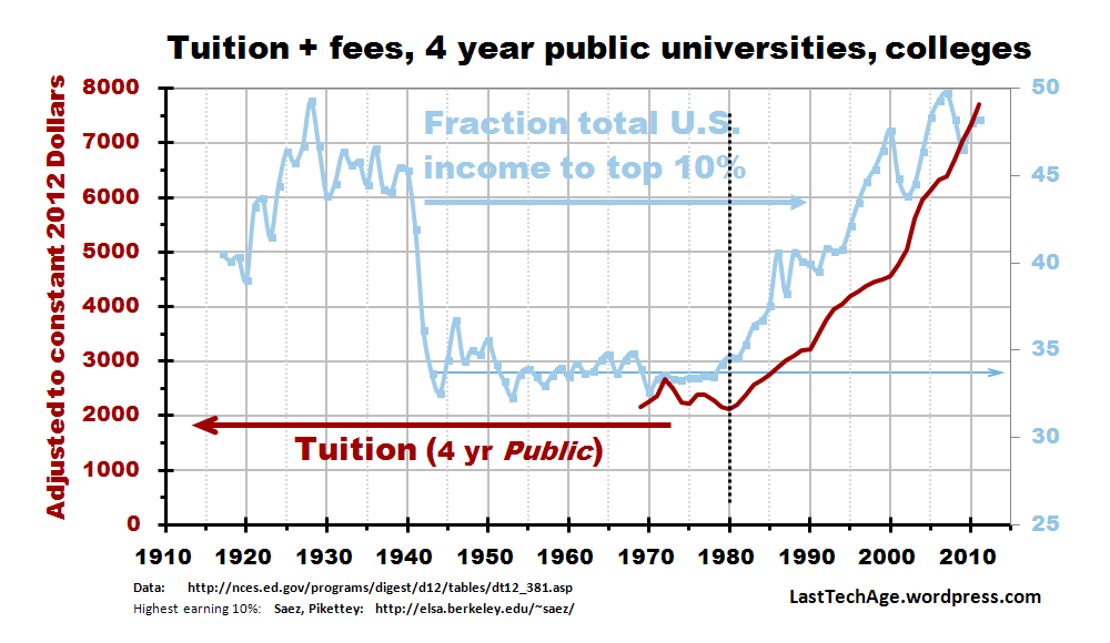
4 year public U
4. Fusion funding correlates KeyTime 20 yr slope of SPI
• MFTF-B , • Piketty , • OFES @ DOE, • Action, • Stiglitz •

Fusion funding
• • • • • • • • • • • • • • • • • • • • • • • • • • • • • • • • •
Charles J. Armentrout – Ann Arbor
Send email: LastTechAge@gmail.com
update 2014 Aug 25
