Data from 7 reserves show the era of cheap oil is drawing closed
We look at the growth of production from oil fields around the world. Is the world closing in on its production peak in petroleum production, has it passed that point already, or, are we still a long way to go – is powerful growth still in our future?
 This report leaves the classical Peak Oil strategy (examining peaks in production) for one that searches for signatures of the end to early-phase expanding growth.
As explained in the Appendix, we look for a time when production patterns break from early exponential growth and roll over to a peak.
This is our expectation, but some of the results surprise.
A Peek at the results:
- Each data set displays the end of its early startup. The time of cheap oil is past for each.
- Each data set displays production peaking.
- Each region has reasonable expectation for future production (as prices rise).
We examine 7 of the largest world reservoirs. Click to jump to the point of interest. United States , Venezuela , Mexico , North Sea – Norway , North Sea – UK , Saudi Arabia , Russian Federation , End Notes ,
Appendix: How To Identify The Status Of A Reservoir .
This report is long but each of the 7 discussions is not. A more detailed discussion is in our PDF library: Patterns In World Oil Production.PDF.
World Oil Reservoirs
 The point of this exercise is summarized by a question:
The world still has 1,653 G bbl in ‘proved’ reserves, are we really in any danger?
————————————————————————
United States
The U.S. was the largest producer of oil in the world in the early 1900s. Production peaked in 1970. This is a reasonable reserve to begin discussions.
Fig 1A shows production from 1920 on. The peak is very sharp and the approach to the peak appears linear. This is certainly not the expected exponential growth.
The Alaskan fields were opened as an attempt to reverse the trend. The abrupt jump in production with the opening of Prudhoe illustrates political pressure on the downside.
Current prices encourage expensive extraction techniques and production has risen strongly since 2010. (Too recent for our graph.)
Fig 1B (log-linear) demonstrates the importance of this kind of graph.
The first 70 years are best modeled with the straight trendline (meaning, exponential on this plot). After 1930, production changed to a linear trendline (curved dashed line on this kind of graph). This is the breakpoint we were looking for.
Growth that is linear, not exponential, is evidence of a stressed industry, and may be why the 1970 peak is so sharp. BP estimates the US ‘proved’ reserves at 30.9 G bbl (<2% of world total).
 Before 1960, many alert observers saw that production was rolling over toward its ultimate peak.
See our Predictive Model post for details.
Fig 1C (linear-linear) displays the fact that data less than a tenth of the largest values can not be seen. This final push to the inevitable peak is clearly linear.
This is a surprise. After 1930, oil companies knew that the time of exponential growth was over. Even WW-II did not boost outputp. This was not a gentle decline to a broad peak, the industry pushed hard but was able to achieve only straight line growth, right to the final very sharp peak. You can just about see in the data that industry stopped its upward stress in the 1960s, then returned to high stress exploration and drilling in the final few years prior to the peak.
Maybe the 1930 end of expansive oil was the basis for searching over the boarders for oil: Venezuela, Mexico, Saudi Arabia and others. And maybe it explains some of our costly military excursions, too.
————————————————————————
Venezuela
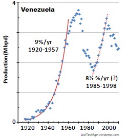
 B.P. lists “proved” reserves for Venezuela as 296.5 G bbl, the highest on its 2012 listing. But others claim the country has passed its Hubbert peak. The Mene Grande field opened in 1914, with full scale production starting until after WW-I. Figs 2 demonstrate the rule in the box.
–
–
–
–
–
–
–
–
–
–
–
–
–
–
–
An exponential trendline would fit the 4× growth between 1920 and 1930, but growth is too small and exponentiation is not certain. The period between 1920 and 1957 do fit a 9%/yr exponential trendline that grew 40×. The exponential rise broke in 1958 and political stress stopped the production and produced a peak this was almost certainly not a due to reservoir reduction. Production gains started again in ’85 and rose along an apparent exponential trend line, although it was only a 25-30% total rise. The 1998 peak appears to be due to Hubbert-style depletion of old fields.
B.P.’s huge “proved” reserves indicate there must be many hard to reach and untouched areas. As oil prices rise in the future, new fields will certainly open to fund future prosperity. This potential reservoir is good news for the country, but will not shield world oil demand from shortages.
Venezuela experienced new-field growth for 37 years before growth rolled away from the initial exponential trendline. The field was nearing depletion and production was vulnerable to strong politics. The current decline appears due to depletion of its aging fields, and will almost certainly grow again as the promised new fields are opened.
————————————————————————
Mexico
Production started about 1901 and apparently grew until about 1920 when politics and business issues blocked significant growth. Mexico did not reach the 1920 level until 1973. The tension was so huge that the fields were nationalized in 1938, and the U.S. immediately stopped all purchases. Production did not reach the 1920 level until 1973.
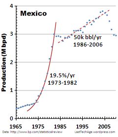
Figs 3A, 3B. Mexican production restarted with the sudden exponential rise of 1973 (ending in 1982). The huge Cantarell off-shore complex was discovered in 1973 and Pemex (the Mexican state oil company) began full production in 1977. In 2003, Cantarell was 2nd in world production, after the Saudi Ghawar field. Mexican production peaked when Cantarell peaked in 2004, and has declined every year to 2011 (BP data).
–
–
–
–
–
–
–
–
–
–
–
––
–
–
–
–
Mexico suffered difficult relations with its Northern neighbor and its oil production did not “take off” until the early 1970s. Its huge oil field has passed its peak and the current situation is that Mexican oil production is steadily decreasing. The good news for Mexico is that increasing oil prices will cause difficult fields to become economically feasible to open and it is probably safe to say that Mexico will maintain some level of production for the remainder of this century (assuming prices continue to rise without end).
BP lists Mexico with 11.4 G bbl in ‘proved” reserves. There are several potentially large fields in the Yucatan region. The large Sihil field lies below Cantarell and the Ku-Maloob-Zaap complex is nearby. Undiscovered fields may lie in the hard-to-explore inland areas, too. As petroleum prices continue to rise, the incentive to open these will grow, opening an economic avenue for that country. Mexico should be listed as lying at its Hubbert’s peak. It is not that new oil will not become available, but cheap new oil will not.
————————————————————————
North Sea – Norway
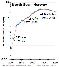
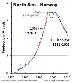
Oil had been discovered around the North Sea basin since the mid 1800s. In the 1960s, the 5 bounding countries split the off shore areas among themselves. In 1969 Phillips Petroleum announced its first discovery in Norwegian waters. Large scale production started about 1971 in this cold, difficult region. Production jumped a factor of 30 in the first 5 years, “leveling” off to an exponential growth rate of only 13%/year. (The US and Venezuela grew its production at about 9%/year.) Starting about 1997, production rolled away from its exponential trend and finally peaked in 2001. Fig 4B shows that this has been a straight line decent, much higher that a normal exponential decay. This indicates that the pumping companies have been trying hard to stop the drop, without success.
–
–
–
–
–
–
–
–
–
–
–
–
–
–
–
–
BP lists Norway’s “proved” reserve to be only 6.9 G bbl. But there are other sources of oil, especially in the Arctic’s Barents Sea, where reserves may be very large.
There are two true issues with this potential field. (A) The territory It is in the arctic circle and where the arctic shelf extends far from shore; the oil will be extremely difficult to extract, and (b) the territory lies outside the traditional national boundaries and the Russian Federation lays claim to it, too. (B) may prove the greatest issue once oil prices have made arctic extraction economically feasible.
Norway has passed its North Sea Hubbert’s peak; cheap, rapidly extracted crude oil is a feature of its past. This does not count the natural gas that still is available.
————————————————————————
North Sea – UK
Oil had been discovered around the North Sea basin since the mid 1800s. In the 1960s, the 5 bounding countries split the off shore areas among themselves. In 1969 Amoco announced a find off the Aberdeen (Scotland) shore (at almost the same time of Phillips’ Norway announcement). Shell UK announced the huge Brent field in 1971. The oil lies in the territories allocated to all 5 countries, but majority was in the UK and Norway.
You have to categorize production from the UK fields as strange. Look at Figures 5. The initial production had a linear rise, not the natural exponential as in Norway’s experience. It rose by a factor of nearly 300 from the 0.01 M b/d rate of 1975 to about 3 M when production broke away from the linear trendline in 1984. Production peaked in 1985 and slid down a nicely rounded hill top. To perform like this you have to hold your processes back. Do not expand your pumping to increase your sales, do not throw money at new platforms and new explorations. And never waste money on safety.
–
–
–
–
–
–
–
–
–
–
–
–
––
–
–
–
Some apologists say this dip was caused by the horrendous 1988 Piper-Alpha platform disaster with its huge loss of life. But is is 4 years after the break from the expansion. More than likely, the P-A ‘issue’ was due to lack of funds being put back into the enterprise by the fine ultras who were reaping the profits. Without financial feedback, you will not maintain the safety of your operations. P-A put a lot of attention on the fields, and when the companies were allowed to resume operations, they did bring production back.
The 1984 peak is almost certainly the Hubbert-style depletion of a finite set of pumping stations. After the ultimate peak in 1999, the UK-North Sea fields have followed theory-classic exponential decay – what you get if you do not expend resources to continue pushing for output.
BP lists the UK ‘proved’ reserves at 2.8 G bbl. Maybe Brit tabloids have discussed what is going on, but is there aggressive exploration occurring around the Shetland islands or further north and east?
————————————————————————
Saudi Arabia
After 5 years of search oil was first discovered in 1938. Exports started in 1939 by foreign companies operating as Aramco (Arab American Oil Company). Skipping over 4 decades of intense stress, this became the Saudi Aramco, wholly owned by the Saudis.
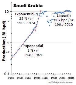
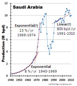
Figs 6A and B show that initial production rose exponentially at 8% per year. The largest oil field complex in the world is the Ghawar fields, the offshore Safaniya ranks as a very high capacity resource, too. During the years just prior to the 1973 Yom Kipper war and the Iranian Revolution, production broke away from exponential growth. The growth between 1969 and 1974 is too short to clearly identify as exponential, although shark-fin shape shows the Saudis were clearly trying extremely hard to boost production.
`–
–
–
–
–
–
–
–
–
–
–
–
–
–
–
–
–
Fig 6A shows that during the 1990s, production scattered about a straight line. One might project the same line into the 2000s. Maybe, but it is also just as possible that production has hit the wall, has begun its downward slide. Time will tell. We do know that strong efforts are underway to increase the extraction technology and to open new fields, especially in or near the Persian Gulf. This is a perilous region, with religious stresses high and present + potential fields valued greatly.
————————————————————————
Russian Federation
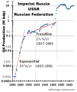
This sad nation has been landscape of nearly continuous stress and conflict. Fig 8A covers the time from the Imperial Tsars, through the Soviet communist reign, to the present fiercely nationalistic Russian state. See the PDF discussed at the beginning for the sources of these data. During Imperial times of 1863-1881, production exploded at 30%/year, expanding at least 300 fold during that short time. By 1900, Tsarist Russia was out producing America. Data shows flat production after 1900 and before the revolution (because…?) but an exponential trendine with a slow 2½ % rise can be superimposed on the data. Not clear Russians then alive would have recognized any kind of exponential boom time, though. (See the normal plot of Fig 7B.)
–
–
–
–
–
–
–
–
–
–
–
–
–
–
–
–
–
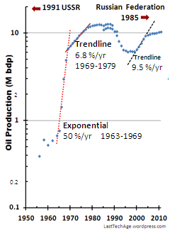
More recently (Figs 7C and 7D), production was boosted by a factor of 10 along an exponential trendline with 50%/yr growth between 1963 and 1969. This bent away along a 9½ % exponential-like trendline until 1979. We skip past the chaotic period to 1998 when production began again in earnest. The tables from 1965 onwards are from BP, which lists the overlap of the USSR and the Russian Federation between 1985 and 1991.
–
–
–
–
–
–
–
–
–
–
–
–
–
–
–
–
–
The net has postings claiming Russia hit its Hubbert peak and is on its oil production decline; we think it is more complicated than that. The current principal fields are the Volga-Urals complex and the West Siberia region. We discuss V-U below. The Siberian fields have associated difficulties, but have been under development for 40 years.
The production bump in 1985 correlates with a similar feature for Venezuela, Norway, the UK, Saudi Arabia, and –maybe– Mexico. US data do not show it. Does it correspond to a drop in international oil prices?
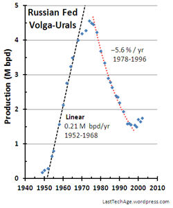
Fig 7E. The Volga-Urals oil field started production in the early 1950s, and rose a factor of 13 along a straight line. The field reached its capacity limited Hubbert-style peak of 4.6 M bpd in 1976. This linear rise is more understandable under state controlled direction than the same pattern under open enterprise for the UK fields.
New technologies are being employed to stop to fall of production, higher oil prices make such things economical.
Rising oil prices push previously tough fields into economical profitability. The Russian Federation has a lot of such non-‘proved’ territory, especially off its northern sea coast. Two possible regions of conflict could be the Barents Sea near Norway and the Chukchi Sea between Russia and Alaska. Both may hold reserves above 10 G bbl, and boundaries are only approximate. A discussion of where Russia will move on next has be the topic of another post. The Russian Federation understands what is at stake, maybe more than even US ultra richies. This is an issue to watch.
————————————————————————
End Notes
The 3 bullet results at the top of the post are certainly true: • The wonderful startup time with its cheap oil is truly over in the world. • Every data set – the easy fields – displays peaking of production. • Every region has more difficult fields in waiting; they would surely produce crude oil if expensive extraction methods were employed.
If oil still sold at $10/bbl, we would truly be in economic crisis, because oil has certainly reached the world Hubbert peak. But we live in Hubbert’s future as he actually envisioned it — oil does not end, but becomes increasingly unaffordable to the lower incomes (2012: In the US, it is earning at or below median household incomes of $ 50,000 /yr). The few US households that capture incomes > $200 000 might feel a bit of a pinch – but the economic elites (> US$ 500,000/yr) and ultras (> US$ 3 M/yr) will not notice in any significant way. (See our Zero Sum Game).
LastTechAge fundamental: We, all the citizens of the world, are facing gradual reduction in the fundamental power source that holds ‘modern’ society together. In the U.S., we have seen a systematic denial of this, and we will have to pay to consequences. The world response is still unclear. The loss of easily extractable oil is one of the early mechanisms in the Income Pump. It just might be the reason it succeeds with finality.
Update: 2012 Aug 10 New issue of Science magazine released today to be delivered next week: News report by Richard Kerr points out reputable estimates say oil production has been decreasing at 4¼%/year but a recent Harvard report by Leonardo Maugeri (economist) says actually only 1/2 this amount. Both of these are exponential decay trendlines as on the right side of Fig 1. Big controversy and the new report might be wrong; but the the fuss shifts focus from fact of oil production decay to its size. Mainline estimates are such that we need to bring a new Saudi production source on line every 3 years just to maintain constant production. I suspect that to keep us at equilibrium balance, price of crude must increase at the same rate that old-field production decreases.
How To Identify Status Of A Reservoir
This is a quick review. Fig A shows a model shape sometimes used for estimating. Real data points would be scattered about the graph, but the points would lie near a trendline (the heavy line).
Key features. Model curve is trendline for data
[1] Exponential Startup. Production (vertical axis) starts up as exponential growth. The dotted (blue) line on the left side of the curve is the exponential growth line which overlays the production trendline
[2] Transition To Peak. This starts at the arrow. Production bends away from the startup pattern, ultimately flattens to a peak value. Extraction is difficult and results are influenced by external factors. There is no reason to expect only a single peak as producers struggle to return to ever increasing sales; many bumps are possible.
[3] End Game Decay. Production must drop with profitability as extraction increases in difficulty and as results become sensitive to external constraining influences. Most models use a symmetrical trend curve for convenience, but there is no logical reason to expect it. Production might ultimately cease when extraction become uneconomical; but if sales justify, it might persist indefinitely as ever more expensive technologies are applied.
The technique in this report to analyze the health of a reserve is to look for the arrow point in Fig A. If we find it in the data, the reservoir has entered maturity and the end of its inexpensive oil is in view. Find discussion of the model in Modeling Depletion Of A Reserve.pdf.
……………………………….
Charles J. Armentrout, Ann Arbor
2012 Aug 9
Have a comment? Click on the title of this post, at bottom, enter ideas.
Listed under Natural Resources …thread Nataural Resources > Oil
Related posts: Click the INDEX tab under the Banner picture


