
The Gini index demonstrates Saez-Piketty trends. These two very different markers show that inequality is increasing.
The trend line for the Gini index (Gini) is well correlated with the trend line from Saez-Piketty Inequality (SPI) studies, although these two ways to estimating inequality are unrelated – different techniques employed by different economists using different resource bases.
We present this result as a graph through time, discuss what Gini and SPI indicators mean, and examine why the Gini marker, part of the standard U.S. Census Bureau (USCB) report, is intrinsically hard to use. Click any image for full resolution.
Gini Index of Inequality
The Gini index is a value devised by the Italian Corrado Gini and meant to indicate the “level” of a country’s inequality. Gini uses data about a country’s economy to calculate a single value G that ranges from 0 to 1. The bigger the G number, the more unequal the society.
G=zero … monetary rewards are uniformly distributed to all
G=one … all rewards are taken by the single ultra rich person in the country.
G is a calculated decimal value (like 0.36) and many nations report it as a percentage of full inequality (like 36). Reported 2012 values – Norway, G = 25; Brazil, G = 69; the U.S. was intermediate, G = 47.7. Our reports use the decimal form.

Fig 1 Corrado Gini 1884-1965
Background The Gini index was invented more than 100 years ago. It has been quietly used in the U.S. for some time, but is not well understood by non-economists.
Signor Gini (Fig 1) was one of the top theoreticians for the Italian Fascist movement, perhaps the reason that his index took decades after WW-II to be adopted outside Europe.
Annual Gini values for the U.S. are available at the USCB website and many analysts plot it using large vertical scales and short time intervals. Such charts show the U.S. Gini to be trending through the years as fluctuations about a continuously rising but curved line.
SPI studies began (in America) with Saez’ 1999 work, and was recently publicized by Thomas Piketty’s book, Capital In The Twenty First Century (C21). Emmanuel Saez provides a much longer timeline and the USCB’s Gini data. The SPI curve has a “hockey stick” shape, with a sudden bend at the key time of 1981. (Piketty usually describes this bend as a “U-shaped curve.”)
C21 demonstrates the growth of economic inequality worldwide and does not use Gini in its calculations. C21’s real purpose is to support its dramatic time line with simple economic arguments to show how SPI arose and to propose at least one way to make it more equitable. We discussed C21 in some detail in the link, above.
Gini data compared with Saez-Piketty (SPI) Data
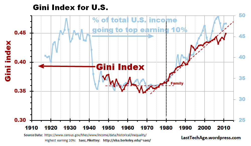
Fig 2 U.S. Gini (dark red) between 1947 and 2012, Seiz-Piketty Inequality curve (background light blue) for the highest earning 10% of society
In Fig. 2, the Gini trend line for families is the heavy dark red curve, data scale on the left side; the SPI trend is the background light blue curve whose scale is on the right.
- Between 1947 and 1980, the data fluctuated around a flat trend line of about 0.36.
- After the key time of 1981, the Family Gini roughly followed a rising trend line right up to the latest available estimates available.
Problems with Gini
One can see an issue already – The “official” 2012 value is G = 47.7, but the USCB dataset shows 45%. Although these data are quoted to 3 decimal places, annual stability is no more than 2 places, sometimes even less … but the problem is deeper than this.
The two bullet points (flat trend after WW-II and rising trend after the key time) are about all that can be said about the Gini data because of data base issues.
The Gini index has 2 good qualities – It is Scale Invariant (G stays constant if all incomes rise and fall together, as with inflation), and it demonstrates the Principle of Transfer (income transfers from a low income individual to a high income individual always cause G to increase). These are important.
However, it does not obey the Uniqueness requirement (2 different inequality scenarios must generate the same G). More about the lack of uniqueness in a different post.
Two specific issues with the USCB‘s Gini data – A more general social classification (Households) was added in 1967; data base methods were modified 1992. Click here for the USCB definitions of Household and Family.
- USCB collected data from Families, groups related by blood or marriage who consent to live together. By 1967, this was not sufficient, and they added Households, people living together in a housing unit. Household includes Family data and includes more economic earners, but does not extend as far back. Gini jumped about 0.02 when Households were introduced.
- Another big change in reporting occurred in1992-94. This added another 0.03 to the running Gini index. One must be careful in using these data.
These and other changes mean that the slope of the trend line after 1981 cannot be determined.
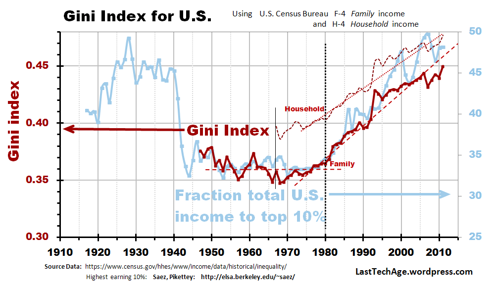
Fig 3 Gini from Family data (solid red), and Household data (dotted red) , Saez-Piketty Inequality (light blue) is in the background. Confusion arises between Family and HH data.

Comment 1 Gini from 1913?
Introduction of the more accurate Household data has truly reduced the utility of Gini records. The 1992-94 changes mean we can not extrapolate a trend line through the 1990s with confidence. After 1981, the trend line has certainly been rising; it could be curved, but is probably a straight – we will never know. Due to the severity of the year-to-year fluctuation, at least another decade will be needed before we can draw a reliable trend line after 1995.
Gini and SPI Show Positive Correlation
The points just after Fig 2 (trend line: • flat after WW-II, • abruptly rising after 1981) show that the two methodologies display similar behavior. While Gini is a flawed tool, it is a useful marker for validating the SPI results reported in the C21 book and other professional papers. Gini and SPI trends to allow us to conclude that inequality is rising in the U.S.
The current set of S-P correlations we have discovered is in the file “Trends correlating with Saez Piketty Inequality.pdf” Click the button [PDF References] under the banner; it is filed under Economy.
……………………………….
Charles J. Armentrout, Ann Arbor
2014 Aug 24
Listed under Economics … thread Economics > Inequality
Have a comment? Click on the title of this post, go to bottom, let us know.
Related posts: Click the INDEX button under the Banner picture

Pingback: What Health Care System Do Americans Want? | Populareconomicsblog
Populareconomicsblog has a good discussion 2017 of the rampant inequality. Thanks for the reference to our 3 year old post.
LikeLike
Pingback: Why are Americans So Unhealthy? | Populareconomicsblog
Pingback: It’s the Law of the Jungle | Populareconomicsblog