
Education debt soars with rising college tuition and correlated Piketty inequality, causing loss of opportunity in America
Want a good job? Though experts say get an advanced degree, tuition costs continuously rise while salaries continuously drop. If you agree to excessive debt at market rates, you must accept the grinding consequences. Data show clear and shocking correlation to Piketty’s “income inequality” (= workers’ fraction of all U.S. wages has been falling since 1981) . Student debt burden has been rising at a well known but astonishing rate.
Post high-school education is expensive and has been growing ever higher for some time, with no good way to pay for it. This should worry you if you are considering how to survive our present and future reality of shriveling opportunities in the American world.
The NCES (National Center for Educational Statistics) is a government agency that reviews current and past American education. We use the current NCES post-secondary education (post high-school) tuition trend data to understand what has happened over the past 40+ school years (1969-70 to 2011-12), then demonstrate a correlation with Saez-Piketty economic changes. See the Postscript for details on our data choices. Click any figure for a full resolution image.
Tuition and Associated Fees
The NCES provides averaged cost data for tuition and fees, for R&B (room and board), and for the total cost. The R&B data really indicates cost of living averages over different localities, and and is a non-education based parameter. Our charts report just the tuition+fee baseline cost of education; R&B is explicitly excluded. But be aware: depending on the location, R&B costs can add another $10,000/yr to the total cost.
Pretty sobering for perspective students.
Four Year Schools
Universities and Colleges that issue 4 year baccalaureate degrees. NCES also provides separate data tables for averages over private 4 year schools and over private ones.

Fig 1 Tuition+Fees — Upper: 4 year private schools., Lower: 4 year public schools
Fig 1 shows the dramatic rise in costs at both public and private schools.
- Public post-secondary school: All state funded universities and colleges. Think of the University of California schools and their much less expensive California State schools.
- Private post-secondary school: Paid for by tuition, fees, endowments and overhead charges on grants. Example: Bryn Mahr, Harvard, Cal Tech.
If they are so expensive, why the demand for a private University? Does a B.S. graduate from Cal Tech mean better understanding of undergraduate physics than one from University of Michigan or Texas? This is arguable. But. Does a graduate from Harvard or Yale have a more powerful or influential network of friends than one from a state university? Certainly. Since most successful steps are take through one’s network of insiders, it is always better to graduate from the best school possible. Thus, bad-student George W Bush went to Yale.
Four Year vs. Two Year Schools
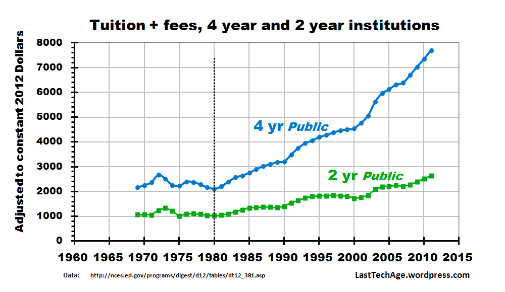
Fig 2 Tuition and fees — Upper: 4 year public schools, Lower: 2 year public schools
- Two year schools provide low-cost classes, allowing students to satisfy requirements for their desired four year school and minimize non-major requirement costs.
- Two year schools issue Associate Degrees to acknowledge successful study.
- Two year schools usually support trade apprenticeships with high quality technical/vocational training. This is one of the greatest values they provide their communities.
Fig 2 compares the annual cost of a 2 year vs 4 year school. The upper curve is the same data as shown as the lower curve in Fig 1. The relative flatness of the 2 year trend reflects the chart display scale, the 2 year costs actually rose more than 2½ times over 1980 costs, in constant 2012 dollars.
The 4-year vs.2-year ratio changed, too. In 1980-81, a class in an average 4 year public school was twice as expensive as the same class in an average 2 year college. Today, this factor is close to 3.
Tuition and Inequality
All three types display a break in trend lines at the 1980-81 school year. The presences and timing of such a visual break suggests we look again using eyes accustomed to Saez-Piketty graphs. Our review of Thomas Piketty’s 2014 book here, our first discussion of the the inferred income pump is here.
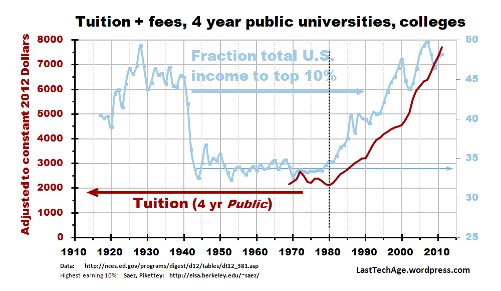
Fig 4 Public School tuition and the top 10% Saez-Piketty graph.
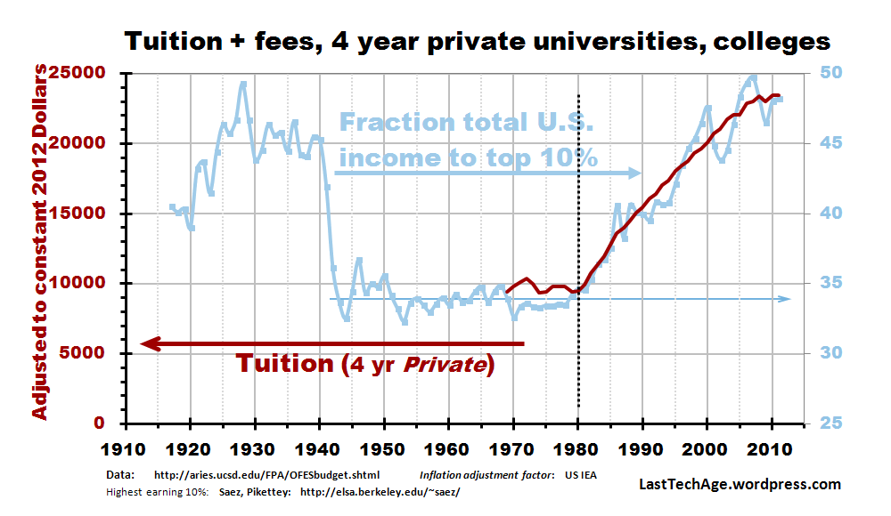
Fig 3 Private School tuition and the top 10% Saez-Piketty graph.
Figures 3 and 4 show the 4 year institution data against the background of Saez-Piketty data for the fraction of the total income earned by Americans each year taken by the top earning 10% of all workers with incomes. Even without clicking for full resolution, you can see that tuition curves are remarkably similar to upper income fractions.
The Finals
The data show the double whammy whiplash being done to American society:
- NCES trend: University tuition has risen high enough to expel most lower wage earners from post high-school education, and are challenging families even near the 90% income point ($130,000). Higher tuition closes access to advanced degrees, to opportunities to enter influence networks, and for opportunities for good jobs.
- Income trend: Meanwhile our ultra high earners (top 1/2% of the earning population) divert to themselves an ever-larger share of the income flow, reducing savings of median workers, assuring their current buying power dwindles away.
Trends A and B have severe impact on personal lives. While our country’s industry was “offfshored” (shipped abroad) and desk “outsourced” (contracted abroad) :
- People are told that to stay in the “middle class,” they must have college degrees,
- Students must acquire new and ever-larger loans to pay for the ever-rising tuition.

Fig 5 Total Outstanding Student Debt, Number of Borrowers with Outstanding Debt, and Average Balance, Relative to 2005 Fourth Quarter, 2005 to 2012
Fig 5 is from a CollegeBoard (makers of the SAT tests) report and shows how student loan debt has changed from 2005. Total loan debt was just over twice that in 2005. Debt increased by about 50% between 2007 and 2012, but the same report shows loans from Federal government actually decreased by 2 between 2007 and 2012.
In 1999, the total loan debt was $119 billion and an astonishing $1.2 trillion in 2014. Note that manufacturing offshoring and outsourcing started in the late 1970s but really grew during the last 15 years.
Figs 3 and 4 show that trends A and B have been advancing hand-in-hand since 1981, are correlated and do reinforce each other. But one does not necessarily cause the other. Just how many other ingredients contribute in this societal witches brew?
As time events moves forward, trends A and B could sharpen much further; America could morph into the land of no opportunity. In such a future, most would be unable to better themselves and unequal life experience would be the norm. In such a world, aristo children, the scions of the top 1%, would get good degrees, would enter insider networks, and would get the good jobs.
As Thomas Piketty says over and again, it does not have to happen this way, we could change things and open opportunity again to all. But the more probable path would be to see tuition costs increase with enhancement of income transfer to the richest few. That is, it is most likely that opportunity will drop while inequality grows.
The current set of S-P correlations we have discovered is in the file “Trends correlating with Saez Piketty Inequality.pdf” Click the button [PDF References] under the banner; it is filed under Economy.
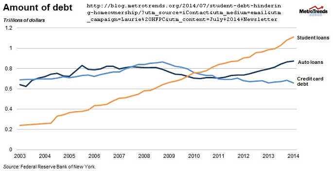
Fig 6: From 2014 Jul 17 MetroTrends blogsite
Update 2014 Jul 27: Maia Woluchem and Taz George published a report on the Urban Institute’s Metro Trends blog that included this chart of the steady rise of student debt (rising diagonal on this chart). They show 2014 debt at $1.1 U.S.-trillion, slightly different from our 1.2 Very good short write-up.
……………………………….
Charles J. Armentrout, Ann Arbor
2014 July 23
Listed under Education
Have a comment? Click on the title of this post, go to bottom, let us know.
Related posts: Click the INDEX button under the Banner picture
Postscript
Over the years, NCES has modified its data base, dropping some parts, expanding others, and consolidation its reports.
Private vs Public schools. NECS also averages the two averages for typical annual cost of 4 year schools, but private costs about three times public (Private = 3×Public). If tuition costs were to stop rising, a student in a typical private school would pay around $64,000 more for a 4 year degree, not counting the R&B. Typical is nearly useless for planning.
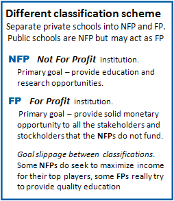 Not-For-Profit vs. For-Profit. One difficult post-secondary category separates FP from the NFP institutions. FP education is a territory inhabited by predatory organizations, what used to be called “diploma mills,” though not all FP schools are diploma mill predators.
Advanced education is a demanding, high stress activity and people not in the education tradition expect (demand?) a diploma when money is exchanged. You pays your money and you gets your car, right?
Some FP providers play this attitude to extract big money – the racket: replace quality education with a pretty, nicely printed diploma. FP education is buyer-beware territory. We use only NFP school data.
A relatively new classroom replacement called MOOCs (Massively Open, Online Classes) make good-guy/bad-guy classification murky. A recent New York Times report says that a MOOC with 700,000 enrollees might graduate a total of 7000 students. MOOCs are different from traditional classes, students are on their own to get the understanding. Some schools require students to come to campus for testing, others allow them done on-line. MOOCs may be natural soil for diploma mills to root and flourish, but it is way too early for a final judgement on the MOOC movement.
Separating predators from the education herd may be impossible because of our cultural acceptance of the economic home-run ploy. Even NFPs tend to channel the legal maximum to their top people: President, executive staff, full professors, etc. Ann Arbor is the traditional home base for the University of Michigan (UofM). The attitude: charge the highest that can be extracted from the students and the research grants and UofM gains. What is wrong with a little greed, anyway? The flow of easy money lubricates the entire system and, carried to its logical end, this argues that to get things done, we (U.S.) need graft and bribery throughout society. This attitude of our times makes education fertile ground for predators to stalk.
About The Graphs You can lie with charts almost as easily as with statistics. For example, All three tuition curves would appear flat if the data were plotted vertically between $0 (bottom) and $1,000,000 (top). It is easy to hide trends by such tricks of graphic arts.
We try to get past chart lies by plotting all the data on the same sized grids. The vertical scale was made similar by requiring the data to fill about 2/3 of the vertical space. So the tuition curves all have about the same span in their max/min vertical extent Finally, we do not smooth the data by averaging over time.

Too many degrees of certain kinds – drama, English literature, etc. – are being produced by schools and students, with no way to employ them – with student loans. I think it a poor use of public money.
Each student should be required to have a useful minor and a backup plan – so they can foreseeably pay back the load.
LikeLike
Add Chemisty and Physics to the list, then. In the current age of contracting opportunity I am not certain what fields will promise a BS degree student a salary that will pay the loan very quickly. Private loan interest can be much higher than inflation and if the graduate cannot pay the loan quickly enough, the debt load can grow faster than raises.
LikeLike